Your website doesn’t need to be flashy to help your business grow. It does need to be clear, trustworthy, easy to use, and ready for people who are deciding whether to call, book, visit, or request a quote.
When a small business website is slow, confusing, outdated, or difficult to use, visitors rarely complain. They simply leave and contact someone else.
Here are seven signs your website may be costing you customers.
1. It loads slowly
People are patient with many things online. A slow website usually isn’t one of them.
If your homepage takes several seconds to appear, visitors may leave before they see your services, photos, or contact information. This is especially important for local businesses, where customers often compare several options from their phones.
A slow site can result from:
- Oversized images
- Too many unnecessary animations
- Poor hosting
- Outdated website software
- Excessive third-party tools
- Unoptimized videos or background graphics
You don’t need to diagnose the technical cause yourself. Start by testing your site on your phone using a mobile connection rather than Wi-Fi. Ask someone unfamiliar with the business to open it and tell you how long it feels like they waited.
A good website redesign for small business should include performance checks before launch. Speed isn’t the only factor that matters, but it directly affects whether people stay long enough to learn about you.
2. It’s difficult to use on a phone
A website can look fine on a desktop and still be frustrating on a phone.
Many customers will first find your business through a mobile search, a social media link, a map listing, or a recommendation sent by text. If they need to pinch, zoom, scroll sideways, or fight with a tiny form, they may move on.
Look for these warning signs:
- Text is too small to read comfortably
- Buttons are difficult to tap
- Images or sections run off the edge of the screen
- The menu is confusing
- Phone numbers aren’t clickable
- Forms require too much typing
- Pop-ups are difficult to close
Open your site on several phones if possible. Check the homepage, service pages, contact page, and any booking or inquiry form.
Mobile responsiveness should be a basic part of a professional website for small business. It isn’t an optional finishing touch. It’s part of making the site usable for the people most likely to contact you.

3. Visitors can’t tell what you do
Your homepage should answer three questions quickly:
- What do you offer?
- Who do you serve?
- Where do you serve them?
If visitors have to read several paragraphs before they understand your business, the message needs work.
Generic headlines are often the problem. Phrases such as “Quality You Can Trust” or “Your Partner for Success” may sound positive, but they don’t explain what you actually do.
A clearer headline might identify the service and location:
- Residential roofing for homeowners in Kerrville
- Skin care and electrolysis appointments in your area
- Reliable bookkeeping for local contractors
- Real estate guidance for buyers and sellers in the Hill Country
Your visitors shouldn’t have to solve a puzzle. Clear messaging helps the right people recognize that they’re in the right place.
This is one reason professional copywriting can make a meaningful difference during a website redesign. The goal isn’t to make your business sound complicated. It’s to make your value easier to understand.
4. The next step isn’t obvious
A visitor may be interested in your service and still leave because they don’t know what to do next.
Every important page should offer a reasonable next step. Depending on your business, that might be:
- Call for an estimate
- Request a quote
- Schedule an appointment
- Send a project inquiry
- Visit your location
- View your available services
Your contact information should be easy to find. Your phone number should be visible and clickable on mobile. Your contact form should ask for useful information without creating unnecessary work.
Avoid vague buttons such as “Learn More” everywhere. Be specific:
- Request a quote
- Book an appointment
- Meet the team
- View our services
- Start your project
A clear call to action doesn’t pressure people. It helps them understand what happens next.
If you receive website inquiries, also check the process after someone submits a form. Does the visitor receive a confirmation? Does the message reach the right person? A well-designed website can’t help if inquiries disappear into an inbox no one checks.
5. The design looks neglected
Your website doesn’t need to follow every design trend. It does need to look current, consistent, and cared for.
Customers may question a business when they see:
- Outdated photos
- Expired promotions
- Broken links
- Old hours or incorrect contact details
- Inconsistent fonts and colors
- Low-quality images
- Large empty areas or crowded pages
- Content that refers to events from years ago
An old website may also create an unfair impression. Your actual service could be excellent, but a neglected site can make the business seem less active or less reliable than it is.
A fresh local business web design approach should reflect the way your business operates today. It should use current information, clear page structure, readable content, and imagery that feels relevant to your customers.
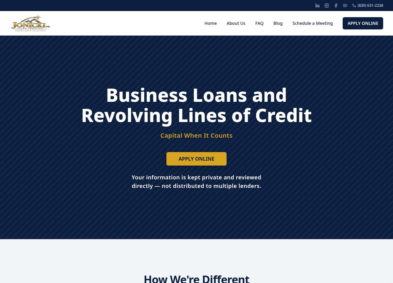
For example, the Jonicki Consulting website focuses on clear services, credibility, and an easy path to contact. The design supports the business rather than distracting from it.
6. Local customers can’t find you
A strong website can’t help customers who never discover it.
Search visibility depends on many factors, and no ethical web designer can promise a specific Google ranking. However, your website should give search engines and customers enough information to understand your business.
Start with the basics:
- A descriptive page title for each important page
- A useful meta description
- Clear service descriptions
- Your service area or location
- Consistent business contact information
- A logical page structure
- Relevant, naturally written content
- A mobile-friendly experience
Google’s SEO Starter Guide explains that search engine optimization helps search engines understand your content and helps users decide whether to visit your site.
You should also check whether your business information is accurate across your website and local listings. An incorrect phone number, old address, or missing service area can create confusion at the exact moment someone is ready to contact you.
Basic SEO won’t replace good service or a thoughtful marketing plan. It does make your website easier to understand and easier to find.
7. There’s not enough reason to trust you
Before contacting a business, customers often look for reassurance. They want to know that you’re legitimate, experienced, available, and capable of helping with their specific need.
Your website can provide that reassurance through:
- Customer testimonials
- Reviews or links to review platforms
- Project photos
- Before-and-after examples
- Certifications or memberships
- Clear service details
- A real team or business story
- A visible location and contact method
- Straightforward pricing information when appropriate
Trust signals should be specific. “We care about our customers” is less useful than a short testimonial explaining what the customer appreciated.
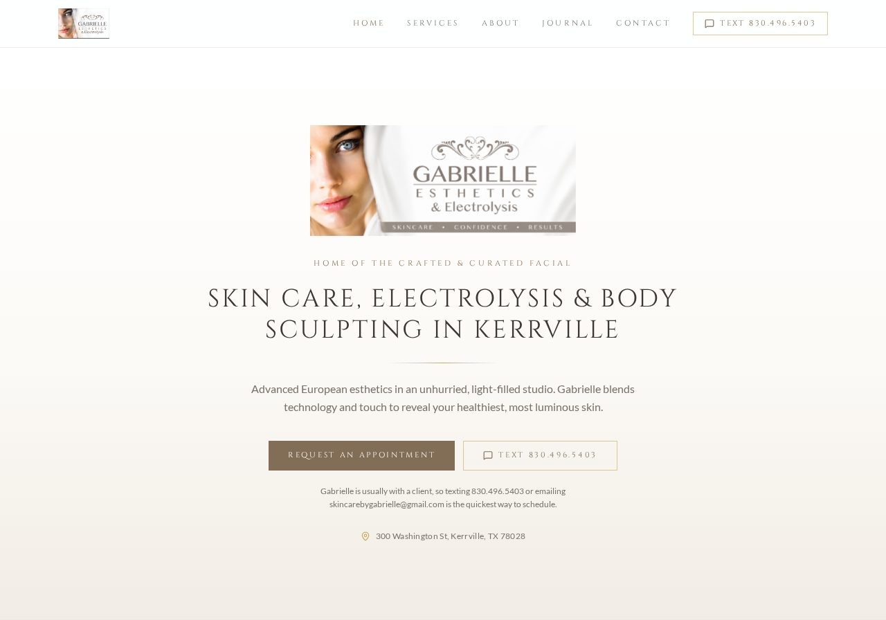
A portfolio can help as well. The Skincare by Gabrielle website uses a warm, service-focused presentation to explain treatments and guide visitors toward appointments.
If your website has no proof that real people use and value your business, visitors may choose a competitor who makes that information easier to see.
How to check your website today
You don’t need a full audit to identify obvious problems. Ask five people who aren’t involved in your business to complete this quick test:
- Open the website on a phone.
- Explain what the business does in one sentence.
- Find the main service or product.
- Find the phone number or inquiry form.
- Say what they would do next.
If people hesitate, get different answers, or can’t complete the process easily, your website may be creating unnecessary friction.

When a redesign makes sense
Small fixes may be enough if your website has a solid structure and only needs updated content, images, or contact details.
A broader redesign may be appropriate when several problems exist at once:
- The site isn’t usable on mobile
- The message is unclear
- The design looks dated
- Pages load slowly
- Contact options are difficult to find
- Local search information is missing
- The website no longer reflects your services
First Look Web Co. builds standard websites with up to five core pages, custom visual design, mobile responsiveness, basic on-page SEO, contact and map integration, and 12 months of hosting. Projects typically take 5–10 business days after the needed materials are received.
You can review the standard services and flat website pricing before deciding whether the approach fits your business. Larger or more specialized projects are quoted separately so the scope remains clear.
Give customers a clearer path
Your website doesn’t need to do everything. It needs to do the important things well:
- Explain what you offer
- Show who you help
- Make your location clear
- Build confidence
- Work on mobile
- Give visitors an obvious next step
If your current site is quietly costing you inquiries, a thoughtful website redesign can make the customer journey easier to understand and easier to complete.
If you’re considering a new site or a redesign, send First Look Web Co. a project inquiry. You’ll receive a clear scope, a flat price, and a practical explanation of what happens next.